Five Best Practices for Testing E-Commerce Consumer Products
Testing e-commerce consumer products is challenging.
Historically, companies have relied on theoretical approaches using mockups, descriptions or static concepts in online surveys and qualitative research. But this has many limitations, and can easily lead to the wrong conclusions.
Modern research technology means you no longer have to rely on such artificial – and frankly risky – approaches. At Emazing Retailing, we have developed our own software that simulates online environments precisely and helps our clients test e-commerce consumer products with interactive mockups. This means that consumers behave more naturally; there is far more behavioural data to analyse; and the results are much more predictive of actual outcomes.
In this article, we share our five best practices for testing e-commerce consumer products in the right way.
See the Emazing Retailing solution live at the Feb 2023 Demo Days

Demo Days Feb 2023
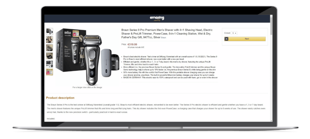
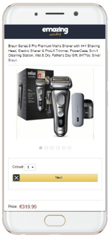
1 Don’t test screenshots: test real e-commerce product pages with interactive content
Product pages are made of interactive content. Screenshots are static. You miss a lot by testing a static screenshot instead of a real webpage.
On Amazon (or any other e-commerce site), you get a very different experience between mobile and desktop. The content renders in an entirely different way. If you use static screenshots, you will completely miss the specific dynamics of desktop and mobile page conversion.
Web pages also typically include additional pictures, videos, and interactive content, and our internal database of previous tests shows that at least 80% of visitors interact with at least one one of these rich content elements. These are impossible to render on a static screenshot, so you would again miss the impact of these on the consumer.
The right approach is to recreate the product page with the same interactive elements that would appear on the original e-commerce page. You also need to ensure that the test page has exactly the same “conversion” rules on desktop and mobile as it would in the live e-commerce environment.
2 Don’t ask: observe quantitatively and go beyond heatmaps
In the same way, we observe a significant gap between what people claim to do and what they actually do in real life*; we also observe a similar disconnect online.
Recently, we tested two different discount messages online with the same discount level giving very different uplift results. However, we did not find this result when we just relied on claimed change in behaviour from surveys. You should choose methods that allow you to observe shoppers do without relying on asking them.
Heatmaps in surveys are better than no data at all – but they will not help you identify whether different people clicked on the same area 10 times or whether someone clicked just once.
We prefer working with an actions log file, recording what is visible on the shopper screen and where this person clicks. Working with such data allows us to answer virtually any kind of question that can appear in the analysis process.
3 Don’t rush to focus on product page content
When testing e-commerce consumer products, an easy mistake is focusing effort on the product page, but the product page needs to be opened to be visible. The primary image is critical to make the product appealing and increases the likelihood of being opened as it appears earlier in the shopping funnel. On average, when considering conversion, any improvement of the primary image is 4x better than a change on the product page itself.
Often clients believe there is little they can do because the product and packaging are as they are. They also need to abide by eRetailer rules: Amazon forces them to have a white background and only display the product itself.
Nevertheless, we saw in test after test that it is still possible to play by the rules and to have a significant impact. For instance, playing with different angles, placing the outer pack, magnifying an element of the pack….there are plenty of ways to try things while remaining within what is accepted.

Of the 5 different primary images above, one was 40% more likely to be clicked compared to the control.
4 Make sure you have the right set-up for your test
It is also essential to be laser-focused on the objective of the test.
Of course, in an ideal world, we would like to learn everything without defining what we want to study at the beginning of the test. Unfortunately, this approach is counterproductive. What is the point of building all competitor product pages if the test is on the primary image? It will be a waste of time and money to do so!
Similarly, we suggest starting directly from product pages if the objective is on the product page. If we begin from the results page, only a portion of shoppers will naturally open the product page we are studying, which will be a waste of respondents.
Setting up the right experience is the best way to ensure the test is insightful. It sometimes takes more time to discuss the proper design of the test than to create it.
5 Test the actual content: don’t believe the format will do the trick
eRetailers keep innovating and provide new formats they sell to brands claiming the new design delivers X% uplift.
The marketing team tends to believe that using this new format will provide the uplift by itself, forgetting the message is at least as important as how it is delivered. Therefore it is crucial to test the content the team wants to deploy using the new format and test it in comparison with the current content.
Let’s consider A+ content on Amazon.
A+ content appears after “From the manufacturer” on a product page. Amazon promises a 15% uplift in page conversion when using Premium A+ compared to standard A+. After a couple of tests, we concluded that the page’s content is what matters. There is not such a thing as an easy +15% conversion coming directly from A+ premium. So better to test your page if you change it!
* ”The correlation between stated intent and actual behavior is usually low and negative,” Gerald Zaltman, Harvard Business School professor, tells us in his well-known book, How Customers Think.
Author

Pierre-Emmanuel Berthier
Company
eMazing-retailing – Real shoppers, real insights
Want to learn more about testing e-commerce consumer products? Get in touch and we’ll show you how we’ve done it for dozens of leading consumer product companies.
See the Emazing Retailing solution live at the Feb 2023 Demo Days